Design of a knowledge base is dynamic . In order to be practical and fitting the real demands and workflow, formatting and structuring has to be customizable. It is a matter of user experience (UX), because a lot is about how users feel when they use it. UX goes to both the users (knowledge consumers) and the editors (knowledge contributors). Therefore it is necessary that the real users has to experiment and experience back and forth, and make changes accordingly and repeatedly. It is an iteration process.
This back and forth exercise is actually the most valuable part of the process because people involved will have to re-think again and again about the usability through deep thinking, and this is actually Action Science.
This is an example of a knowledge base design for demonstration purpose, according to the desired user experience, practicability and usability, and the effort spent in content creation and editing. In this example, the following had been considered:
Design Objectives
- Efficiency to capture relevant information, most of it from the web, experience and experiments. Sufficient but not over-spending unnecessary time.
- Convenience and efficiency for retrieval of necessary knowledge when needed:
- Locating the right piece of information in the fastest possible manner
- Not necessary to read through entire document before finding the right information.
- Satisfy users' needs at different levels with different knowledge and experience. Some may require more explanations, but some just enough for the job. Same knowledge base is planned for beginners too, so it should serve the purpose of training, learning and reference.
- Additional reference information in links and short descriptions to record origins of information, important or relevant related information.
- Other possible related knowledge that might be relevant.
Design Outcomes
As a result, the following features are employed:
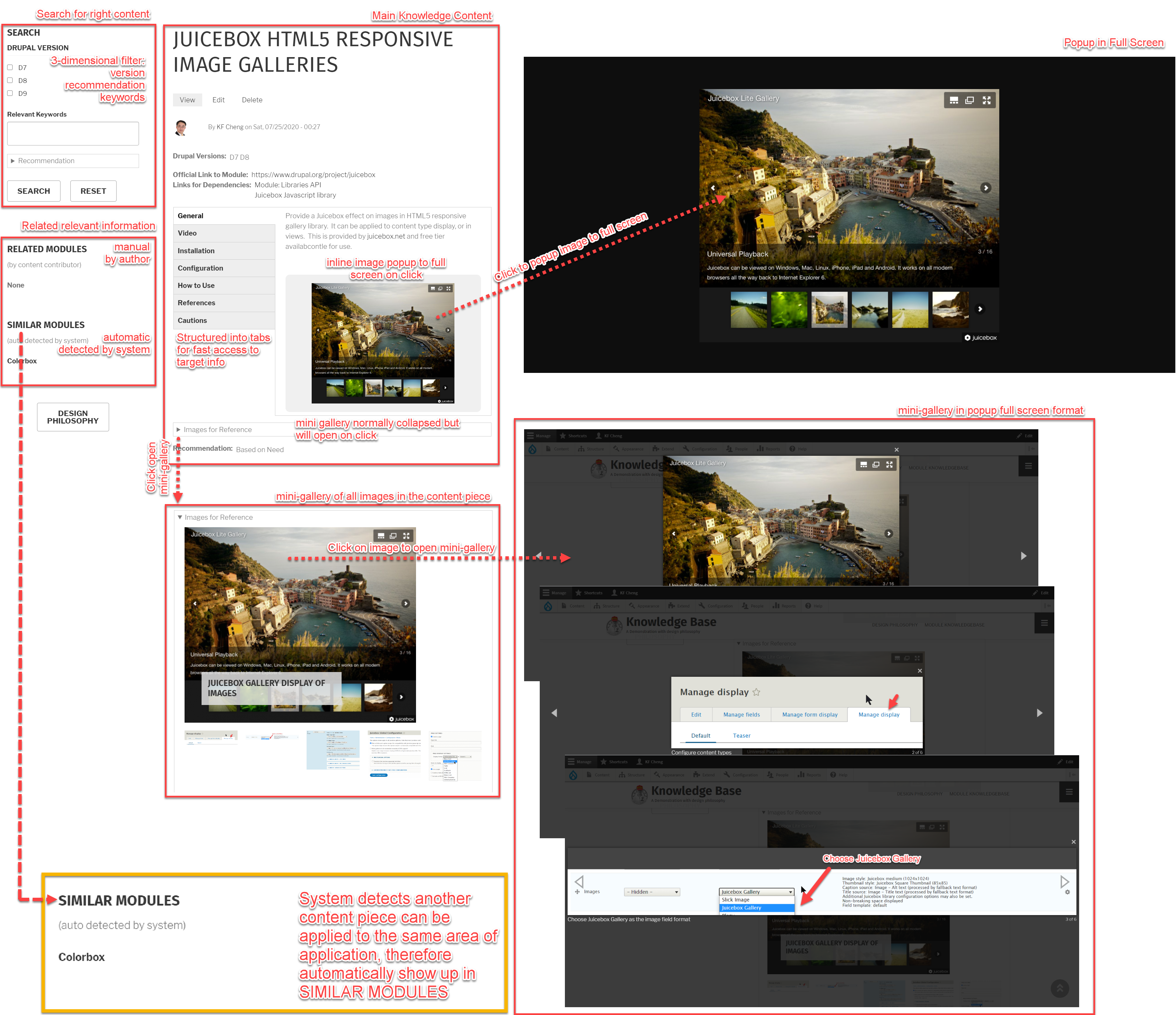
- Short sessions separated in tabs, making it easy to go directly into the target piece of information. It is an internal classification of information into sessions.
- Tabs are collapsed not only to save space. More importantly not to be distracted with unnecessary information right in the beginning.
- Pictures which popup in full screen with captions for explanations. In such kind of knowledge base, pictures are better than words. Popping up in full screen is important when it is the main focus for knowledge retrieval.
- Classification (taxonomy) in different dimensions combined with search to filter the right information from the knowledge base. This is the search mechanism on the left sidebar.
Special Feature
An intelligent design has been implemented. When the system detects another relevant content piece(s) which can be applied to same area of application, it will show up automatically in the SIMILAR MODULES in the left sidebar.
There are 2 categories on the left sidebar:
- KNOWN RELATED MODULES: known information, which is what the content contributor can manually added for user reference. This is from contributor's best own knowledge at the time of editing.
- SIMILAR MODULES: unknown information but automatically detected by system that it might be relevant. In this example, system detects same knowledge can be applied to similar area.
Explanation of Design Philosophy in 1 Page
Designs can vary from person to person, and case to case. Following are the concept and philosophy behind this example in 1 page: