
General
This module is used to create a slideshow of any content, not just images, which appear in Views and customizable.

Following are some features worth attention:
- It supports both in Views and individual image Field in content types, separated by different sub-modules.
- In Views setting, captions can be added to each image from selected field, such as title.
- For individual content types, FlexSlider format can be used for a multi-image field.
- Option sets can be setup for different FlexSlider for different control elements and speed
- Rich examples included in the FlexSlider Example sub-module to provide example settings and usage
Video

Installation
- Install the FlexSlider library and place under /libraries as /libraries/flexslider
- Follow normal module installation procedure. Required dependent modules are Image, File and Field, but all are already included and available in Drupal 8 core.
After installation, there are a total of 4 sub-modules:
- FlexSlider - basic module required, normally need to work with other sub-modules.
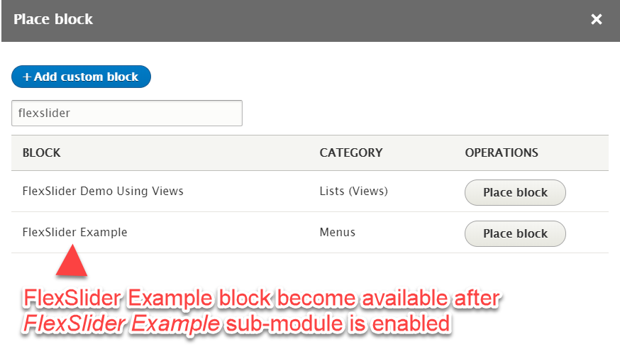
- FlexSlider Example - when enabled, an extra content type FlexSlider Example will be added. Some sample content and views will be created too.
- FlexSlider Fields - needed by the FlexSlider Example sub-module, will provide an FlexSlider format for the format of image fields under Manage Display of content types.
- FlexSlider Views Style - required when used in Views. After enabling, an extra option FlexSlider will be available under the Format in Views.
Enabling FlexSlider Example, it will also require to enable the remaining 2 sub-modules too.
Configuration
It is relatively complicated because there are many different options.
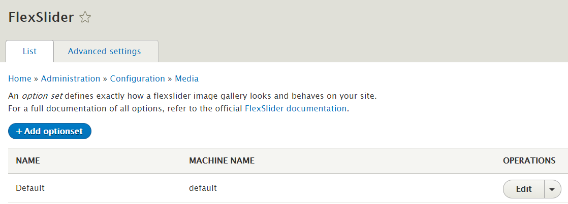
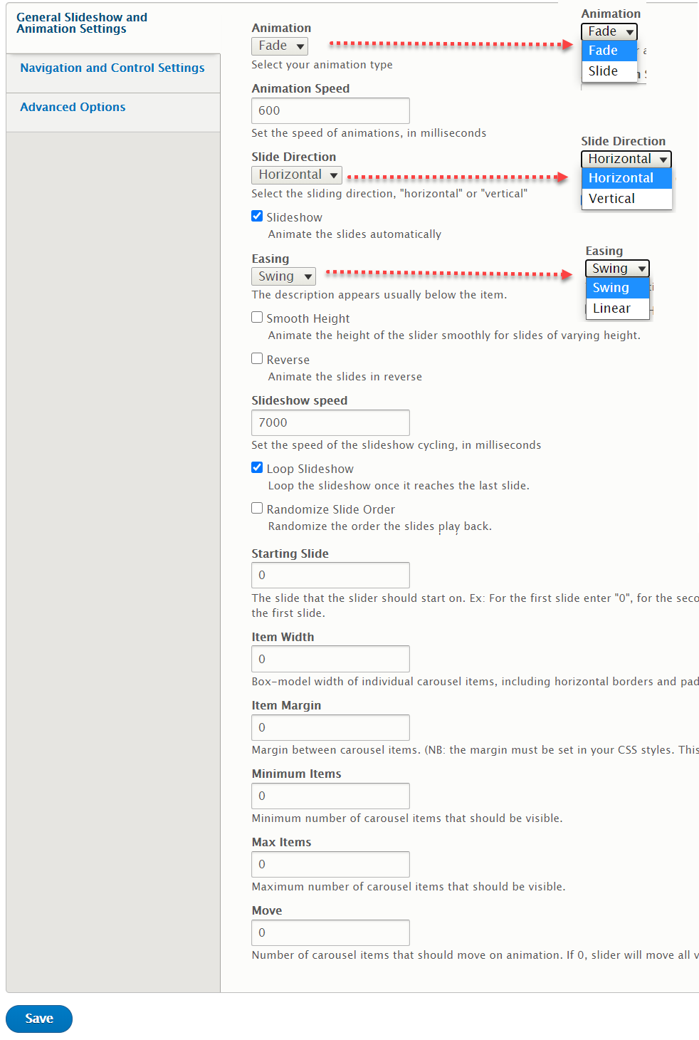
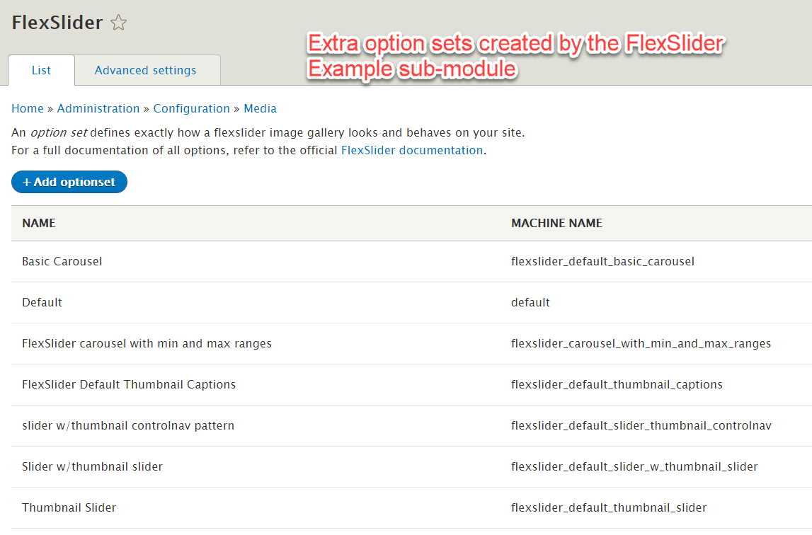
After installation and enabled, the basic FlexSlider module can be configured @ /admin/config/media/flexslider. A default optionset is already available. More option sets can be added if necessary, and used in different parts of slideshow effects in the system. Option set controls the behavior of the slider which as controls and timing.
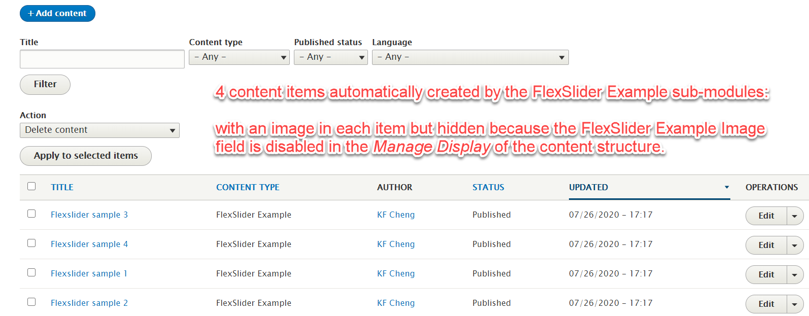
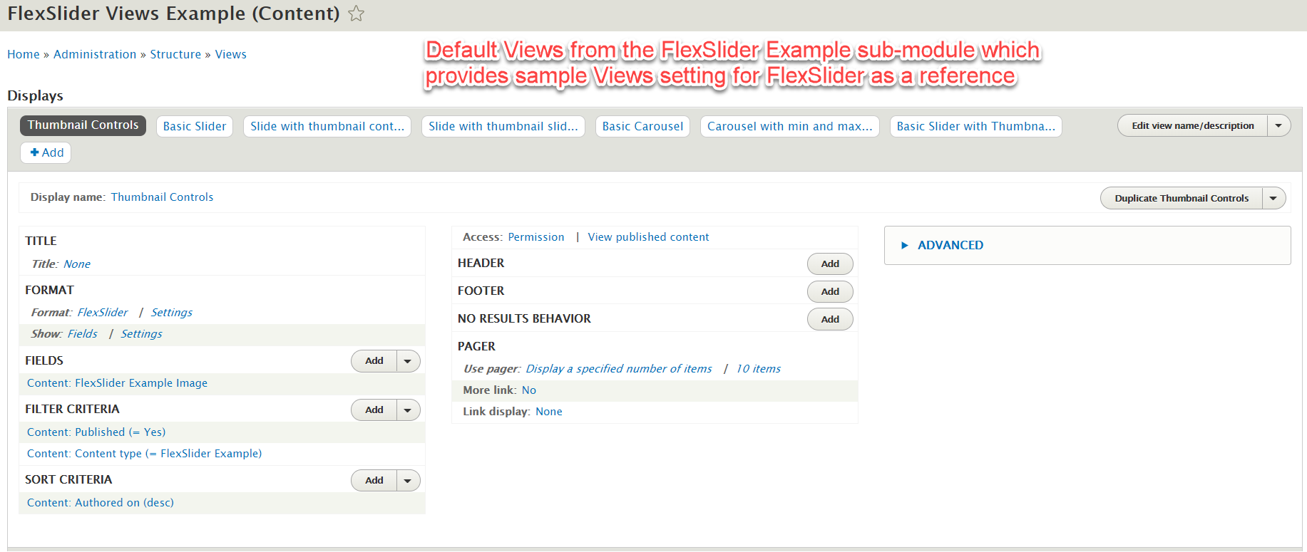
If the FlexSlider Example sub-module is enabled, it gives good examples of how FlexSlider can be setup, and is a good reference on how to configure it. Enabling this sub-module also enables the FlexSlider Fields sub-module. Note the following changes after enabling this FlexSlider Example sub-module:
- Extra FlexSlider Example content type created
- Extra FlexSlider Option Sets created
- Extra FlexSlider Views Example Views created
- Extra FlexSlider Example block created
- 4 Extra FlexSlider Example content created, with sample images already included.
It is good to have this FlexSlider Example sub-module enabled and take these default settings as reference. After enabling this sub-module, do the following:
- Go to Block Layout @ /admin/structure/block
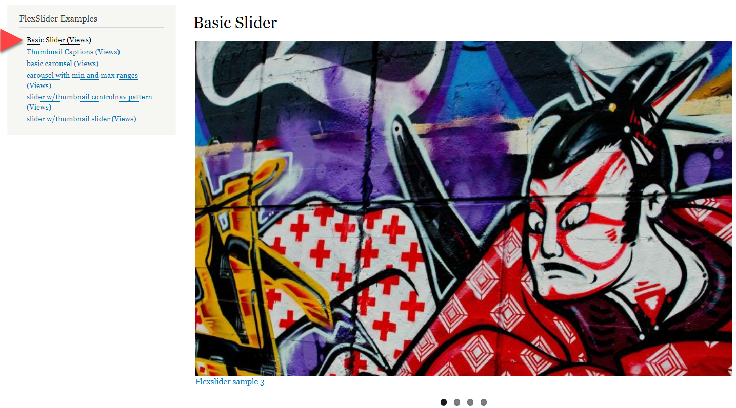
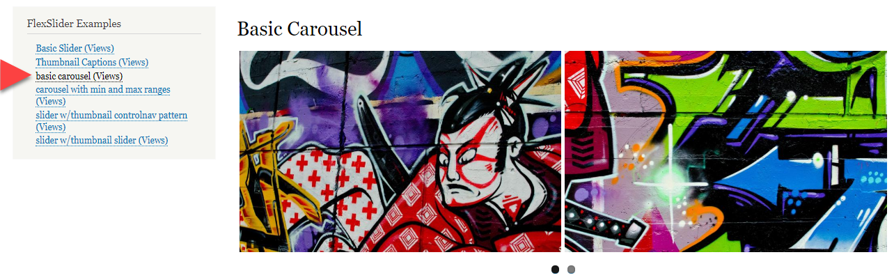
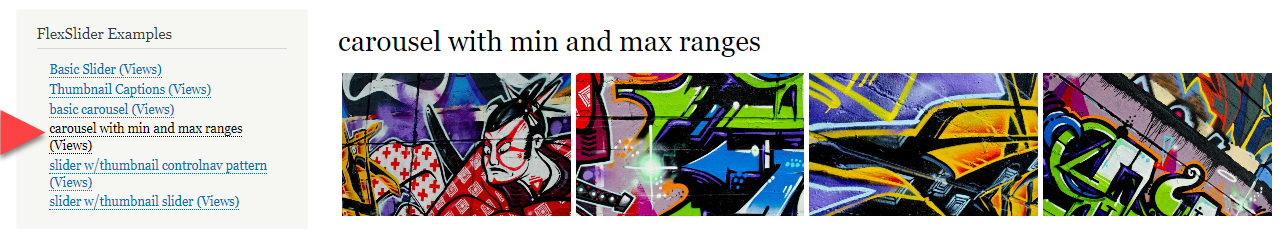
- Place the FlexSlider Example block in the sidebar first region and save
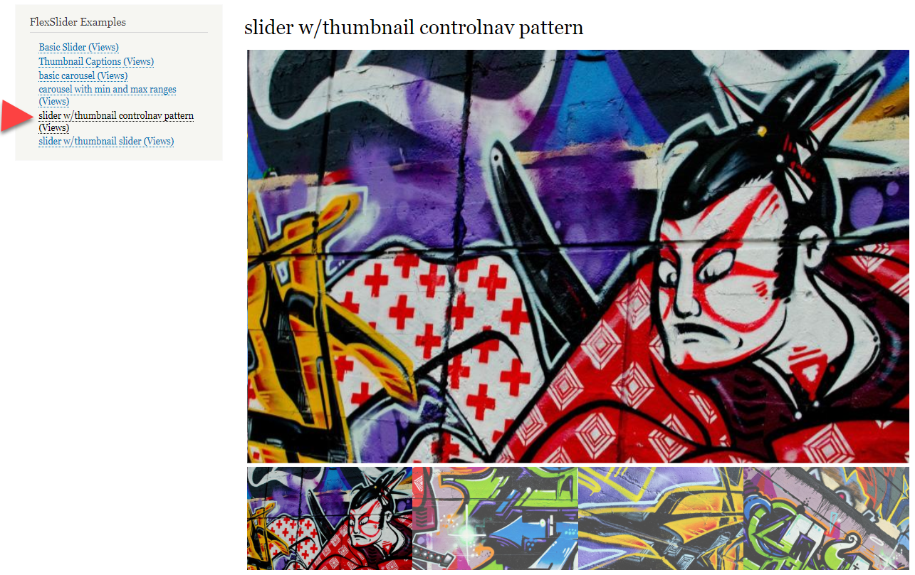
After this, the FlexSlider Example block on the sidebar gives 6 different links, each showing the appearance of these 6 different examples composing of slideshow and carousels, including thumbnails. The above mentioned items especially the created Views, Option Sets and the way Content Type was setup are good references. There are a lot of images with captioned illustration and explanations included in this knowledge piece which also serve as good quick reference.
It is not a bad idea to enable the FlexSlider Example sub-module, then delete the unnecessary content items or content types later when no longer needed.
How to Use
There are several ways FlexSlider can be used:
- The slider can be in a block such as a banner with slideshow effect, or in a content type.
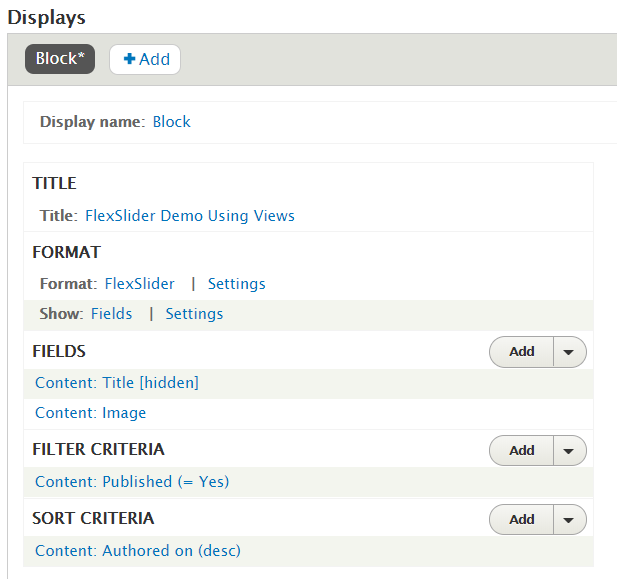
Use in Views
Note that the FlexSlider Views Style sub-module must be enabled. Common use is to create a block using Views, configure images to be used, and produce a block which in turn be placed in the right region such as region for header, highlight or banner. Follow the below diagrams to configure. In particular, if the Link Image To field is set to File, clicking on the displayed image will be enlarged as an overlay.
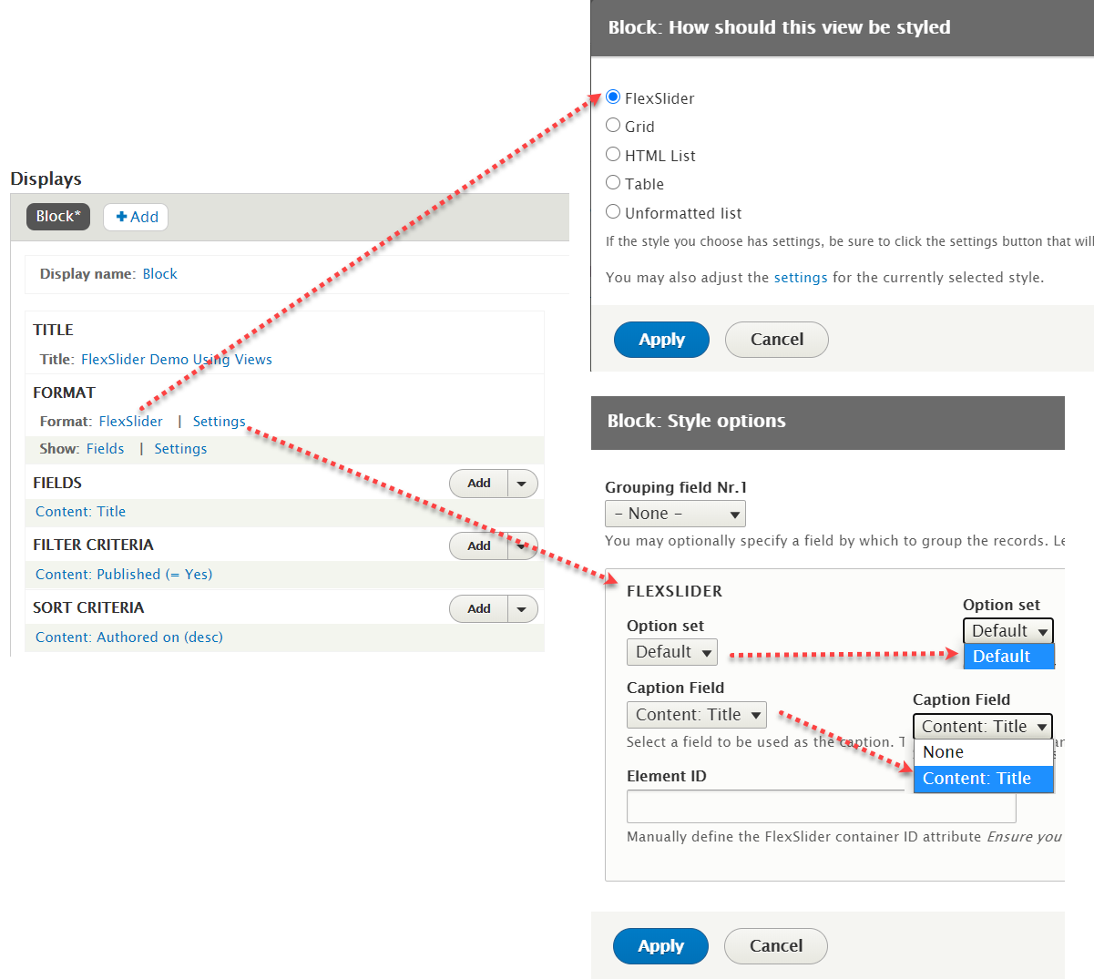
Note that here the Title field, or other field added and chosen, can be the caption of the image in the flexslider show.

Use in Content Type Display
In this mode, images for a particular content type can display images in a flexslider manner for that particular content piece, normally used when multiple images are displayed. This way the images would not occupy too much space, and give a feeling of tidiness. This can be particular useful for display different pictures of a single product, as an example.
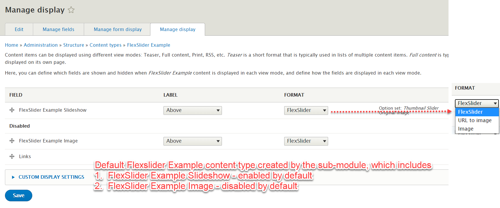
- Create an image field in the target content type, and set the Allowed number of values to Unlimited or multiple numbers, because FlexSlider is not applicable for a single image
- Under Manage Display, choose FlexSlider as the Format
- Configure details of the format:
- choose the target Option Set
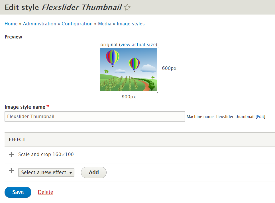
- choose the right Image Style. Create one separately if nothing suitable from the available styles
- choose caption source from other text field, including Title or Image ALT attribute
Images for Reference

FlexSlider


 - scale & crop 800x500")
 - scale & crop 160x100")


